How to Pick The Right Font Set
Choosing the right font set for a project can significantly impact the overall aesthetic and effectiveness of your design. With countless options available, it can be overwhelming to make the right choice. However, with a thoughtful approach and understanding of the different aspects to consider, you can confidently select the perfect font set for your needs.

Understand the Purpose and Audience
Before diving into the sea of fonts, it's crucial to understand the purpose and audience of your project. Are you creating a professional document, a playful website, or an elegant wedding invitation? Different contexts call for different types of fonts. Additionally, consider your target audience—what kind of fonts will resonate with them and effectively convey your message?
Fonts and Target Audience
Serif Fonts: Traditional and formal audience, such as older demographics or individuals in professional industries like law and finance.
Sans-Serif Fonts: Modern and tech-savvy audience, including younger generations and those in creative fields such as design and advertising.
Script Fonts: Creative and artistic audience, including individuals in industries such as fashion, beauty, and lifestyle.
Display Fonts: Bold and attention-grabbing audience, suitable for industries related to entertainment, events, and marketing.

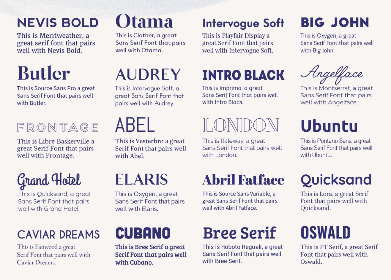
Pair Fonts Appropriately
Creating visual harmony is paramount when picking a font set. Typically, a combination of two or three fonts works best: a primary font for headings and a secondary font for body text, along with a potential accent font for special elements. The key is to ensure that the selected fonts complement each other and create a cohesive look.
Consider Readability
No matter how visually stunning a font is, if it sacrifices readability, it may not be the best choice. When choosing a font set, consider legibility and how easy it is to read across different mediums. Fonts should remain clear and easily readable, especially for longer bodies of text.

Reflect the Brand or Message
Fonts play a crucial role in conveying the personality and message of a brand. Whether it's a corporate brand, a personal blog, or a marketing campaign, the chosen fonts should align with the brand's identity and values. For instance, a tech company might opt for sleek, modern fonts, while a children's book publisher may choose more whimsical and playful ones.
Some common messaging fonts and the impressions they give off:
Arial: Clean, modern, and professional
Times New Roman: Traditional, formal, and serious
Comic Sans: Playful, informal, and lighthearted
Calibri: Approachable, friendly, and easy to read
Courier New: Retro, old-fashioned, and classic
Verdana: Clear, straightforward, and versatile
Georgia: Elegant, formal, and traditional
Helvetica: Simple, sleek, and contemporary
These fonts can convey various tones and styles, so it's important to choose the right one based on the message you want to communicate.

Test and Iterate
Once you've narrowed down your font choices, it's time to conduct some practical testing. See how the fonts appear in various sizes and weights, and across different devices and screens. Additionally, gather feedback from colleagues or peers to gain different perspectives. Often, minor adjustments can make a significant difference in the overall impact of your design.

In the design process, the importance of choosing the right font set cannot be overstated. By understanding the context, pairing fonts appropriately, prioritizing readability, reflecting the brand or message, and conducting thorough testing, you can ensure that your font set enhances the visual appeal and effectively communicates the desired message of your project.
Remember, selecting the perfect font set may require time and experimentation, but the end result will undoubtedly elevate your design to new heights.